

General
 September 2026
Why Is My Website So Slow? Find the Cause Before You Pay for Fixes
"Slow" is a symptom with five common causes, and they need completely different fixes. Ten minutes of measurement saves you from paying to solve the wrong one.


Architects, photographers and designers are the most demanding audience a website can have, because they evaluate the page itself before they get to the work. A misaligned grid or a lazy type scale is not a detail to them — it is the first thing they see.
The other half of the problem is weight. This is the one vertical where the content is almost entirely images, at the highest quality the client can supply, and where a slow gallery undoes the impression the design just made.
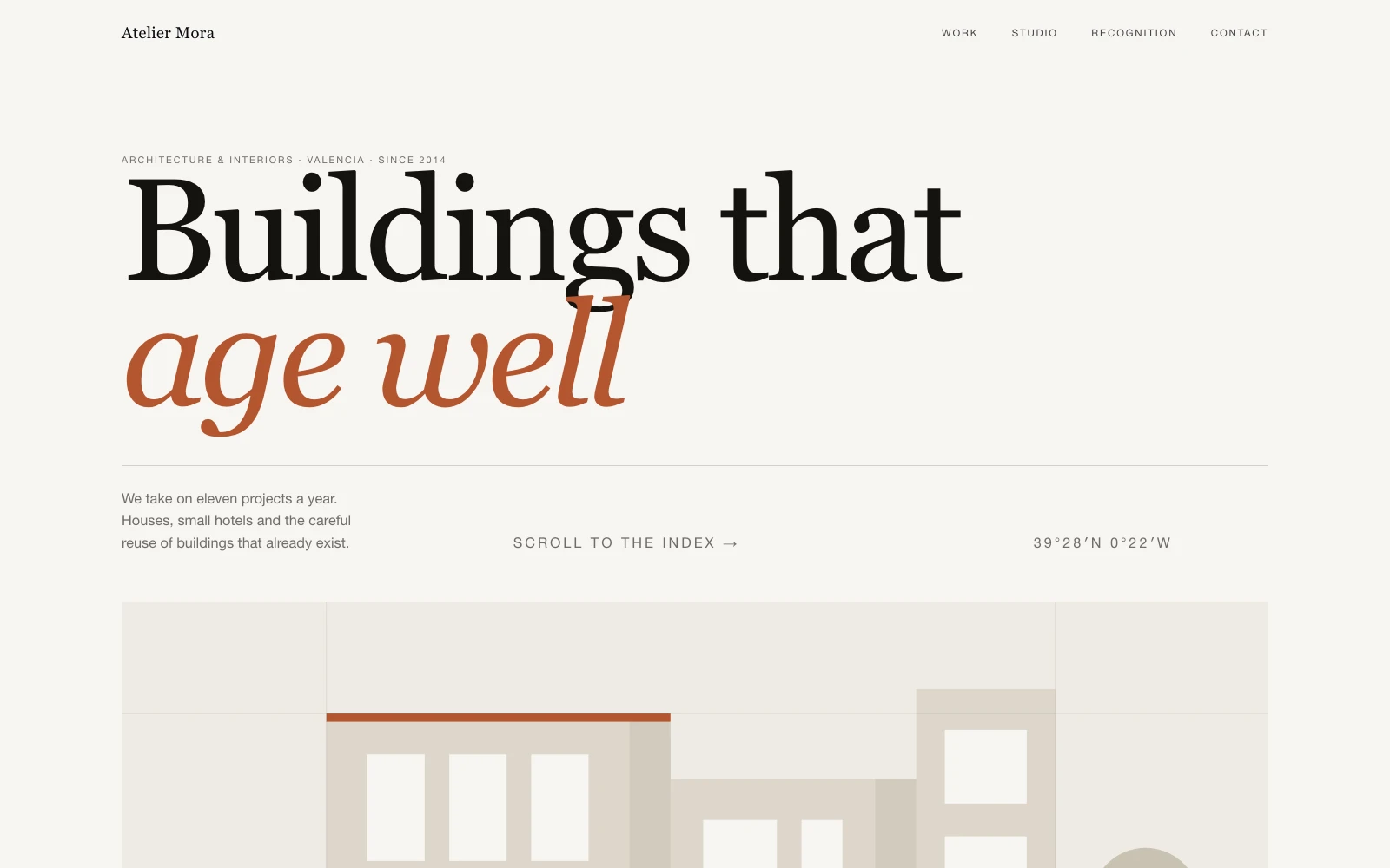
I built a print-structured portfolio for an architecture practice — work shown as a numbered index with drawings that follow the cursor, one navigation staying legible across light and dark halves via mix-blend-mode — and an animation-led WordPress photography portfolio with interactive galleries and parallax.
With this little decoration, type scale, line length and spacing carry everything. At large sizes, letter spacing and where lines break are decisions, not defaults.
Practices list their work as a record — numbered, with programme, size and year. A grid of squares flattens a body of work into wallpaper.
Serve images at the size they display, lazy-load below the fold, and set explicit dimensions so nothing jumps. A gallery that stutters cancels out the craft above it.
The page should stay quiet until the visitor asks it for something. Hover previews and scroll transitions work here precisely because everything else is still.
Uploading full-resolution images because "quality matters", then serving them at 600 pixels wide
A template portfolio, which this audience identifies in about two seconds
Work shown with no context — no brief, no site, no year, no role
An intro animation between the visitor and the work
Text set at one size throughout, so nothing has hierarchy
No way for the owner to add a project without a developer

Custom design solutions for any project. Creation with 8 years of professional experience. You can get consultation, prototyping, and development-ready design. Find out more about it inside.

Professional blog development tailored to your brand — fast, responsive, and SEO-optimized for growth.

Next.js and React for sites that do something rather than just say something — accounts, dashboards, live data and app-like interfaces.
Tell me what the site has to do. You get an honest range the same day.
 Discuss project
No. Modern formats at the displayed size look identical and weigh a fraction. What damages quality is a browser downscaling a 4000-pixel file into a 600-pixel slot.
Yes — that is the point of building a content model rather than hand-coding pages. Adding a project should be filling in fields, not commissioning work.
Only where it does something. In this vertical restraint reads as confidence; a hover preview or a snap-scrolling rail earns its place, an intro sequence does not.
From $600 for a focused single-page portfolio. A full site with a project index, case pages and bespoke interaction is typically $1,200-2,800 depending on how much of the motion is custom.
September 2026"Slow" is a symptom with five common causes, and they need completely different fixes. Ten minutes of measurement saves you from paying to solve the wrong one.
 September 2026
Webflow deserves better than being lumped in with drag-and-drop builders. The real difference is not quality — it is what happens the day you want to leave.